RELATED TIBETAN SCRIPTS

Thursday, 26 August 2010

The birth of the Tibetan written language.


"Divinenamic (Divinely Dynamic) Calligraphy" This art piece is intended to represent the historical sacredness of Tibetan calligraphy, written in an ancient style of the Uchen script; often used on the introduction
pages of Tibetan manuscripts. Gold leaf letters on painted lapis like base, 76x28 cm Tashi Mannox

According to the legend of how the Tibetan written language came into being.... the bright luster of Gold lettering embossed onto the deep contrast of Lapis-lazuli precious stone tablets; is how the first Tibetan alphabet formation was presented to King Sangtsen Gampo (c 617-698 CE), by celestial beings called ‘Dakini’.
The kings’ minister Thonmi Sambhota developed the Tibetan script to accommodate the influx of the Buddha’s teachings, Sutra and Tantra manuscripts from India. Thus the Tibetan written language was born.
The presentation of calligraphy in gold on a Lapis coloured base is therefore associated with the most divine and honorific forms, often emulated as interior decoration futures in Tibetan temple decoration and as heading pages to important Tibetan manuscripts.


Friday, 30 July 2010

Pure Perception


“Sacred Mantra” 73x56 cm Chinese ink and Japanese mineral paint on Heavy watercolour paper, created by © Tashi Mannox 2010 for the III International Exhibition of Calligraphy 2010


The description of the above calligraphy art piece features two main elements of sacred calligraphy:
1. The Mani mantra in the White vertical Phags-pa script:
The neo-Mongolian/Tibetan Phags-pa script was devised as a uniformed style by the Tibetan Lama ‘Blo-gros rGyal-mtshan’, during the regime of the Great Kublai Khan 1260-1294.
Phags-pa was also known as the new Mongolian script called Horyig in Tibetan. This was imperially imposed as a national script of the Mongol empire of the Yuan dynasty 1271-1368 encompassing all of China.
This particular Phags-pa script style used by Tashi to represent the famous Mani mantra of compassion, originates in 1348. This was discovered scribed on stone tablets at Juyonguan in China, located at the nearest section of the Great Wall to Beijing.
Only fragments of this beautiful form of Phags-pa style survives today, great effort and research were made to resurrect the Mani mantra to a correct representation in this rare script style, much due to the guidance of Andrew West, who is an expert in ancient scripts of the Far East.
The Phags-pa script bears some resemblance to Tibetan but differs distinctly in that it is written vertically downwards in columns running from left to right, much like Mongolian. Units are often formed of several characters that are separated by spaces.
From top to bottom the Phags-pa script reads om ma ni pad me hum.
2. The wishing prayer occupies horizontal lines of dark indigo ink in the Tibetan Dru-tsa script style:
Dru-tsa is one of the several U-med script styles, which is traditionally used for more ornamental calligraphy. The cursive form of the characters lends its self well to a more free style calligraphy that can be skilfully expressed in longer elegant tails and vowel signs.
In contrast to the architectural structure of the Phags-pa script, is a wishing prayer to engender a pure perception of our world being a divine heavenly realm, that all beings are the embodiment of loving kindness; the Bodhisattva Avalokitesvara and all sounds vibrate the sound of the six-syllable mantra. A full translation of this pure perception prayer is shown below:

Integrating everything into the spiritual path:

Each and every being in this universe is Avalokiteshvara, the embodiment of compassion,
Every sound heard hums the melody of the six sacred syllables,
This very place is truly the Pure Land of Great Bliss,
Devoid of any actual reality, like a magic show, like a dream.
It is as though we had already been reborn there.
As we cultivate “pure perception” with great joy, all veils are cleared.
One should practice “pure perception” in the way explained above.
Translation by Katia Holmes 2010

The blue ‘Utpala’ lotus represents transformation from relative to ultimate; on the open lotus is a white moon disc, which represents stainless purity. Emanating vertically from the seat of the lotus is the Mani mantra. The background of green to blue swirls suggest the water on the pond of Saṃsāra, the ocean of suffering for which compassion and understand is engendered.
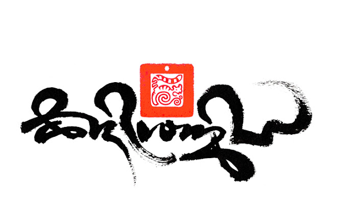


oṃ maṇipadme hūṃ

The Mani mantra in 'high' Uchen script style, © Tashi Mannox 2010.


This year the Contemporary Calligraphy Museum hosts The III International Exhibition of Calligraphy 2010 in the historical Russian town of Velikly Novgorod. The main theme of the exhibition is 'Sacred Calligraphy', which the above piece called 'Sacred Mantra', was create by Tashi and donated to the Contemporary Calligraphy Museum especially for this particular calligraphy collection.

The exhibition extravaganza features art pieces of world class calligraphy artists from 43 countries, opens and runs September 10th -12th 2010.


High Uchen script style on a base of Lapis-lazuli stone effect, this translates as
"(Spontaneously) Sacred Calligraphy". The most precious of Tibetan calligraphy is said to be embossed in gold on tablets of Lapis-lazuli stone, of which this art piece emulates. © Tashi Mannox 2010.


Wednesday, 30 June 2010

Divine Proportion


The words in the Tibetan Uchen script style translate as "sacred calligraphy", 57x76cm, Chinese ink on high quality water colour paper. © Tashi Mannox 2010.


Earlier this year the Contemporary Calligraphy Museum in Moscow invited Tashi to exhibit in their 2010 International Exhibition of 'Sacred' Calligraphy. This is to be held in the majestic Medieval City of Velikly Novgorod, considered one of the jewels in the crown of old Russia.

Below a short vide was also made as part of the exhibition 'interactive' which shows the process of creating the above calligraphy. A stage by stage demonstration, from the proportional layout in relation to the italic brush width, the application of the calligraphy to finish with the signature and 'chop' seal impression.


A more detailed explanation on the proportional construction of the Uchen script can be found here.

Sacred Calligraphy.
A short essay from the viewpoint of a Tibetan calligrapher, by Tashi Mannox.
The definition of 'mantra' is a sound or collection of syllables that are considered capable of transforming the relative to the ultimate mind.
Mantras are not just ordinary words written and spoken, but as they originate from an enlightened mind, such as a Buddha, they are considered sacred in their letterform and their quality of sound.
Historically the divine proportions of the syllables originated in ancient Sanskrit and later translated into other sacred languages such as Tibetan.
The Tibetan written language was developed to accommodate the migration of the Buddhist teachings from India, classified as Sutra and Tantra. The establishment and practice of these teachings was expressed in various art forms such as iconography and Calligraphy.
Because Mantras are considered sacred and symbolic of an enlightened mind, there is much respect and veneration involved. There is a set code of correct proportions of the syllables, which is, not just pleasing to the eye, but also having the effect of ‘liberation through sight’, connecting the viewer to what is ultimately pure. The same can be said for the sound of the mantra, which on a deeper ‘vibration’ level has a metaphysical effect addressing balance in the body and mind.
The act of writing a mantra can also be considered a meditation. Once a calligrapher is fully established in the formal tradition of a calligraphy style, relying on this discipline, allows confidence in the freedom of expression to manifest in the very moment of creating the mantra; the deliberation of the calligraphy is best approached with a mind free of any bias. Indeed such a meditative approach can be applied to any form of calligraphy.
What makes calligraphy sacred is not just a religious matter. The subject of the calligraphy should be from a divine source, the form of the lettering should be in respect to the spiritual tradition, and the approach in the creation of the calligraphy should be pure and meditative. This can then be called sacred calligraphy.
The effect of a sacred calligraphy piece is to lift and inspire the viewer, to cause intrigue to investigate further, to connect and awaken.
Tashi Mannox 2010.

Monday, 5 April 2010

Tibetan calligraphy in the Arab Emirates


Sharjah Calligraphy Biennial 2010

Sharjah is the third largest of the seven emirates that make up the United Arab Emirates; Abu Dubai is perhaps the more well known neighboring emirates state to Sharjah.
Sharjah boasts The Sharjah Calligraphy Museum’, being the only museum in the Arab world devoted entirely to calligraphy and located in one of the cultural capitals of the Arab world.
The Sharjah Calligraphy museum aims to instill the art of calligraphy in the people and visitors of Sharjah, to set new standards both locally and internationally. The Museum represents the Arabian heritage of Islamic calligraphy as well as other calligraphy traditions from around the world.
Earlier this year, Tashi was invited to participate their fourth international exhibition: Sharjah Calligraphy Biennial 2010, with this letter of invitation:

Dear Mr. Tashi Mannox,
Directorate of Art of Department of Culture & Information – Government of Sharjah is pleased to extend its greetings and would like to inform you of organizing the Fourth Session of Sharjah Biennial for the Art of Arabic Calligraphy for the period from 7 April to 7 June 2010, under the patronage of H.H. Sheikh Dr. Sultan Bin Mohammad Al Qasimi, Member of Supreme Council and Ruler of Sharjah, therefore, the higher committee is pleased to invite you with your distinguished works in this important festival.

Three major calligraphy pieces of Tashi’s are to show in the Sharjah calligraphy biennial 2010, the exhibition starts 7th April and runs until 7th June 2010.


One of the pieces shown at the Sharjah Calligraphy Biennial 2010: "Prosperity" 57x76 cm, ©


Saturday, 13 February 2010

Iron Tiger


Happy Losar !

Tibetan new year of the Metal Tiger.


Kagyu Tiger, From the Black-on-black series, Tashi Mannox 2008.
102x73 cm, mounted board, gold and silver leaf.

The three hum characters in gold, that ride the back of the tiger are the three essential syllables of the Dorje Drolo yidam practice, a wrathful manifestation of Guru Rinpoche, Padmasambava, practiced to overcome inner and outer obstacles.


May it be a year of Iron like strength, to accomplish all wishes swiftly as a tigers leap.


Click here to view a Losar 2010 good wishes from H.H. 17th Karmampa, Ogyen Trinley Dorje.


Sunday, 24 January 2010

Himalayan Festival


Here's a chance to see in the flesh a few of Tashi's Illuminated iconographic calligraphy pieces, Shown as part of London's first Himalayan festival.
Meet Tashi in person at the opening from 8pm Monday 8th February 2010 at the Nehru Centre, Mayfair.
Himalaya Exhibition combines art and photography to give an introduction to the cultural forces and trends flowing through the present-day Himalayan Region. It remains open from Monday 8th February until the end of the festival. Entry is free.
The landscape and peoples of the Himalaya show an infinite variety, but a young Singaporean photographer, Sam Kang Li, has gone further than most to document them all, having carried his camera through Nepal, India, Pakistan, Afghanistan, and even China. His striking photographs are rooted in humanity and tell us many stories of the Himalaya’s people. Cultural traditions from North and South of the mountains meet here, and this is evident in the work of the three young Himalayan artists who are showing their work at the Exhibition. Tashi Norbu hails from Bhutan, and Govinda Sah “Azad” and “Tene” Garbuja from Nepal. All have trained both at home and in Europe, and the work of each reflects a rich and diverse range of influences, from their native countries, from India, from Tibet, from the sacred and the secular, and from their life experiences. British artist Tashi Mannox is also contributing work to the Exhibition. Trained in Tibetan calligraphy, his beautiful paintings combine classical iconography and script with modern sensibility.


Wednesday, 6 January 2010

Creating black.


"Resplendent" 57x76 cm Chinese ink on Nepalese rag paper. Tashi Mannox 2009


There is a form of traditional Tibetan scroll Thang-ka ཐང་ཀ་ painting, which is applied to a black background, normally for the depiction of the more wrathful deities. A similar technique was also used in creating more elaborate Tibetan manuscripts, as out-lined in a previous blog.

The effect of illuminated imagery from a black base; has given Tashi's creative work a new dimension in the world of Tibetan calligraphy.

The creation for Tashi's black on Black series that features in his calligraphy website:Tashimannox.com is a technical affair of old and modern applications.

Technically, the first stage of a 'black' calligraphy is to paint a rubber masking fluid on the paper. Black ink is then applied, the rubber resisting the water based ink.


Once the ink is totally dry, the rubber mask can be carefully peeled away to reveal the clean white of the paper.


Any bright colours can then be painted in the white areas to give an illuminated jewel like brilliance. Other calligraphy is sometimes added with more black ink, giving the signature 'Black on Black' effect. The below image shows additional lettering in gold leaf, this is achieved by first painting a gold size directly onto the black background, then carefully applying Gold leaf.


"Five colored Hum" 57x76 cm, Dutch gold and acrylic paint on a black Chinese background, Nepalese rag paper, as part of the Black on black Tibetan calligraphy series, Tashi Mannox 2009. for a more detailed explanation on the meaning of this piece, including the translation, please visit here.