RELATED TIBETAN SCRIPTS

Saturday, 18 December 2010

Tibetan script styles


དབུ་ཅན་དང་དབུ་མེད


A sample of a woodblock print showing both Uchen and Lantsa Sanskrit, the original script style of the Buddhist manuscripts of India in the 6th century.

Perhaps the most well known Tibetan script style in the West is the classical Uchen script དབུ་ཅན། recognisable by it's distinct angular appearance, especially in the straight heads of the letters that align horizontally; from which the rest of the letter hangs down from.
The name Uchen translates as 'with head', as apposed to another class of Tibetan script styles 'without head' called Umé དབུ་མེད།


དབུ་ཅན།

A page from a Sutra, illuminated in gold hand-painted Uchen lettering on a polished indigo/black stained paper. Traditionally it was considered a meritorious act of reproducing sacred scriptures as well as a way to preserve the 108 volumes of the Buddha’s teachings 'Kangur’ and the 224 volume commentaries 'Tengyur’ to both the ‘Sutras’ and ‘Tantras’. These vast manuscripts were often copied in pure gold ink by highly skilled scribes and held in the monasteries as treasures of veneration and as a symbol of the holy dharma


Historically the Uchen script style was developed to accommodate the translation from Sanskrit and the reproduction of the Buddhist teachings that migrated from India into Tibet around the 7th century A.D.  
As Buddhist literature was commonly reproduced in Tibet as wood block prints, the Uchen script was further adapted to lend its self as a more practical script style for hand carving the wood blocks. Because of this employment of the Uchen script; it is sometimes known as 'block script', which also describes its angular appearance, very much as a result of the nature of wood carving.

Woodblock printing Tibetan manuscripts, this ancient form of printing is still being practiced at the famous printing house in Dege, East Tibet.


Although Uchen is known as the classical script style and has an important role in Tibetan Buddhism, there are far less Tibetans that actually write Uchen. Tibetan handwriting is more practically practiced with the faster cursive Umé class of styles, as apposed to Uchen which takes much more care and time to construct.


"The Four Noble Truths" 

Japanese mineral paint on Bhutanese Tsasho bark fiber paper, 58x80 cm 


Above is a clear example of a hand painted Uchen script, this particular style is a 'high' form of Uchen, used mostly for the head page of illuminated manuscripts, this style derives from a text of the 15th-16th century from the great Tsurphu monastery in central Tibet, famously known as the seat monastery of the Karmapa's.


དབུ་མེད།
There are many different forms of the Umé scripts, when learning Umé there is a specific chronological order, from the more uniformed constructive forms called Tsugring ཚུགས་རིང། meaning long form and Tsugtung ཚུགས་ཐུང་། meaning short form, to the more cursive styles གཤར་མ། of which there is the every-day writing styles of Khyug dri འཁྱུག་བྲིས། meaning nimble writing and Kyug dri རྒྱུགས་བྲིས། meaning quick writing.
There are other intermediate script styles བར་བྲིས། such as Tsugmakhyug ཚུག་མ་འཁྱུག། a sub style between Tsugtung and Khyug yig. Petsug དཔེ་ཚུགས། often used for hand-written texts and books, of which is traditionally associated with different regions of Tibet, such as the Khamyig ཁམས་ཡིག། a script style referring to the Eastern Provence called Kham.
For the more artistic form of calligraphy Drutsa འབྲུ་ཚ། is used, this script style is particularly flamboyant and cursive in style, traditionally used for official documents and titles.


In old Tibet the monasteries where the great power houses of learning, they provided education starting at a young age, a number of schools and universities could be found within the grounds of the larger monasteries, where learning to read and write the Buddhist scriptures was an important part of the monastic education.


ཚུགས་རིང།
The first script style to be mastered is Tsugring or sometimes spelt sugring སུག་རིང། meaning long limb, indicating the distinct character of this script style as long height of the letters.
Much practice with a steady hand is needed to pull the long tails or limbs of the letters to a straight unwavering vertical line. As paper was an expensive commodity in Tibet, young monks practice on slates or black painted wooden pallets called "Jangshing", these are marked with construction lines at the desired proportion, then dusted with chalk.
A bamboo cut pen is then dipped into water, the letters are then marked through the chalk dust, to be practiced over and over re-chalking the pallet each time.

A young Tibetan monk practicing the Tsugring handwriting style, Photograph courtesy of Shannon O'Donnell.

Once the Tsugring script style is mastered, then the student moves onto the next script style of Tsugtung, (a shorter form of Tsugring) accomplishing each style respectfully; until the more quick/swift Khyug script styles are achieved, only then may a student be inclined to learn to write the Uchen style.


Corresponding script styles of the first five letters 
with the four vowel signs of the Tibetan alphabet


Here below is the first part of the Alphabet in the Tsugring script is shown with the construction lines as a guide for neat handwriting and to give the correct letter proportion.

The correct proportion of the Tsugring letters is determined by the thickness of the pen nib, 
this measures as 'one' unit, the main body of the letters is made up of two parts of 4 units, 
totaling 8, the long tails of the letters is a further 11 units.

ཚུགས་ཐུང་།
Tsugtung is similar to Tsugring in style, the main difference is that the letter height is overall shorted.


ཚུག་མ་འཁྱུག།
Tsugmakhyug is a sub script style that sits between Tsugtung and Khyug. It has a less formal appearance, with a more rounded letterform and shorter vowel signs.


དཔེ་ཚུགས།

The next script style is Petsug ,often used for the publication of books, as this script style has a distinctive short angular style with short vowel signs, this means that the lines of text can be placed closer together. It was commonly used in the Kham Province of East Tibet, which lends it another name Khamyig, meaning ‘writing of Kham’. 
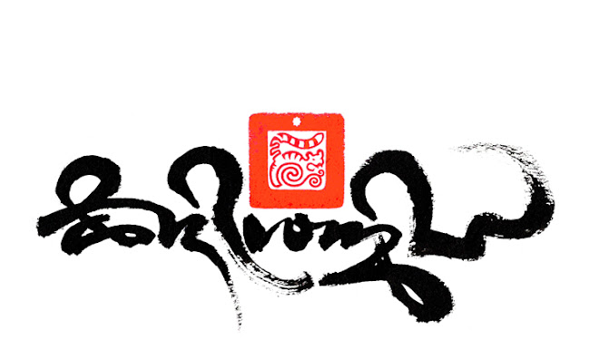


འབྲུ་ཚ།
Drutsa is the most cursive of the Tibetan script styles, because of this it is used generally for artistic calligraphy. Perhaps more feminine in appearances, the rounded forms of the letters can be exaggerated and flourished to fit all shapes and orientations.


འཁྱུག་བྲིས
Khyug is known as the quick writing style, used for swiftness needed for normal handwriting. Its cursive form with vowel signs that stand up freely yet joined up to the main body of text, means that a separation of a different colour is not easily possible.

Tuesday, 14 December 2010

We are what we think.


The Dhammapada is a collection of over 400 verses given by Buddha over 2560 years ago, these teachings of the Buddha are just as vibrant and relevant today as then. They have contributed as many famous quotes that inspire and express the basic Buddhist principles, which are cherished by Buddhists of all traditions.
The Dhammapada was one of the first Buddhist texts to be translated into English as early as 1830, yet it was only translated into Tibetan from its original Pali text in later years.

Perhaps the most widely know quote is "we are what we think", this derives from the very first twin verses of the Dhammapada. There are many translation variations of these verses, below is the translation of Gendun Chopel which can be found in a fine Tibetan English publication of the Dhammapada by Dharma Publishing: ISBN: 0-913546-98-4


A detail from an illuminated calligraphy called "Like a Shadow" showing an artists impression of the monk Caksupala, whom the twin verses where spoken to. Here the Tibetan robed monk, with his shadow, holds the heading character of the first verse. © Tashi Mannox 2010.


“We are what we think. All that we are arises with our thoughts. With our thoughts we make the world. If the mind is clear, what ever we do or say the mind will bring happiness that will follow you like your shadow.
We are what we think. All that we are arises with our thoughts. With our thoughts we make the world. If the mind is polluted, what ever we do or say leads to suffering which will follow you as a cart trails a horse.”


"Like a Shadow" 76x57 cm © Tashi Mannox 2009, Chinese ink and acrylic paint illuminate a background of a wash of Earl Grey tea stain.

Above and below the complete two verses shown in the classical Tibetan Tsugring script, below in the Tsugtung script, these script names describe the styles as long script and short script.

An example of the Tibetan Tsugtung script style, the vowel signs that sit above and below the main body of text are highlighted in blue. © Tashi Mannox 2009.


The text of the final verse is shown tumbling off the back of a cart pulled by a fleeing horse, the analogy of this is the artists impression of the last verse: "suffering which will follow you as a cart trails a horse".


༄། དུས་ཀྱི་ཉེན་ཏེ་རྒྱལ་པོ་འགྲོ་གྱུར་ན། ལོངས་སྤྱོད་མཛའ་དང་བཤེས་རྣམས་རྗེས་མི་འབྲང། སྐྱེས་བུ་དག་ནི་གང་ནས་གར་འགྲོ་ཡང། ལས་ནི་གྲིབ་མ་བཞིན་དུ་རྗེས་སུ་འབྲང།


When his time has come, even a king has to die, And neither his friends nor his wealth can follow him. So for us—wherever we stay, wherever we go—Karma follows us like a shadow.
Sūtra of Instructions to the King


High quality Limited edition prints are available of "like a Shadow" in two sizes: Larger @ 67x50 cm and smaller Half size @ 50x36.4 cm

The reproductions are premium-quality giclée printed, on mould-made papers (the finest and oldest paper-making technique) of 310-315 g/m². The papers; Velin and Aquarelle 100% rag, are of museum conservation standard, ensures stability and UV colorfast ink longevity of more than 120 years.

Each image is carefully colour matched and in sharpness to the original artwork. The prints are hand signed and stamped with one of the artists’ personal seals.

If you wish for a print please contact Tashi to place your order, stating the name of the art piece, the size and address to where you wish the print to be posted.


Thursday, 2 December 2010

Guru Padma


༄། པདྨ་འབྱུང་གནས་ལ་ན་མོ།


For Tibetans Guru Rinpoche or Padmasambhava in Sanskrit, is regarded as the second Buddha, who historically came to Tibet during the 8th century to transmit Vajrayana Buddhism. At that time Tibetans were known to be wild and unruly, a land to be subdued of its demons. Guru Rinpoche, meaning precious guru, tamed and established Buddhism in Tibet, founding the first monastic community at Samye in central Tibet. This formed the today's oldest tradition called the Nyingma school, which is very much the foundation of the other great schools of Tibetan Buddhism.
As a devotional practice, Guru rinpoche is considered to over-come inner and outer obstacles and therefore furthers ones spiritual progress inwardly and ones outer activity.

Padmasambhava has many names such as Guru Padma and Pema Jungne which mean lotus born. Iconographically he is often depicted seated on a lotus, as above, representing the purity and transformation. His pure land, as much a mind state of liberation, is the place of the copper-coloured Mountain in the North-West part of the sacred realm of Orgyen.


© Tashi Mannox 2022


In the above calligraphy; the mantra of Pema Jungne is shown at the top in a high form of the Tibetan Uchen script, below which is the same mantra in an ancient Lantsha Sanskrit, the original written language from which much of the Buddhist teachings and practices were translated from into Tibetan. The mantra, very much a supplication of the attainment of 'siddhi' and blessing of body speech and mind. In Sanskrit the mantra is pronounced:

oṃ āḥ hūṃ vajra guru padma siddhi hūṃ

The smaller text and as the same in the calligraphy below is known as the 'Seven Line Prayer' of Guru Rinpoche: tsig dun sol deb, this translates as:

hum, to the North-West part of Orgyen, seated in a long stemmed lotus with anthers, such wonder! called lotus born - Pema Jungne, who achieved the highest of spiritual accomplishments and who is accompanied by myriads of Dakinis. I will act according to your example. Please come and grant me your blessing. guru pema siddhi hum.

© Tashi Mannox 2010

Here the seven line prayer has been arranged surrounding the main 'hum' character, the seed syllable of Yidam Pema Jungne. This is a study piece demonstrating the Petsug script style and to work out the layout for the final art piece as shown below. It is often the case when executing a major calligraphy art piece, where a large amount of text needs to fit the confines of a space, the size of the lettering and spacing needs careful consideration and planning.


Tashi adding the finishing touches the multi coloured lotus flower.


ས་མ་ཡཿ རྒྱ་རྒྱ་རྒྱཿ


Friday, 26 November 2010

Emanate from Emptiness


en arche


In the beginning there was the word.... It is of course impossible to describe emptiness in a word or to portray emptiness in a calligraphy art piece, other than not painting anything what so ever or just leaving a 'void'.
At the start of just about every Tibetan Sadhana prayer says: "from within emptiness....." (as the text spells out above). Thus the development stage of the practice begins, born out of emptiness, to mind creates the visualization, the text chanted explains and guides step by step to a complete embodiment of body speech and mind, inseparable from the practice 'Yidam' deity, in meditation and mantra, only to dissolve back into emptiness from where it was born, and the practice is completed.


The above calligraphy of the mantra of The Prajnä Päramitä Sutra or more commonly known as the Heart Sutra, sometimes named the Gaté mantra in reference to how the mantra of the Heart Sutra is pronounced:

tayata om gaté gaté para gaté para sam gaté bodhi swa ha.


The calligraphy of the Gaté mantra is painted in the Dru-tsa script style, the tails of the letters extend pointing to the empty center of the paper from where the mantra seems to emanate from.


This is the second rendition of the Gaté mantra that Tashi has created, both based on the same design of the mantra spinning off a central axis, the first piece was sold before a quality photograph was taken of the art piece, then due to popular requests, a second calligraphy was painted and photographed to produce high quality giclée prints. these are available in two sizes of 60x42cm near to actual size of the original and half the size at 42x30cm.
For more details on prints in general and how to place an order, please follow the link here.


Friday, 19 November 2010

Precious metals.


Tashi brushing off the loose Dutch gold.


Gilding genuine gold and silver leaf is used throughout much of Tashi's artworks, particularly on his illuminated iconographic pieces.
The gilding can be quite a precarious process which goes through several stages before the final polish and luster effect is fully appreciated.

By first applying the transparent glue size is like using invisible paint and all too easy to miss areas or over paint blindly.
The size needs to dry to just the right tackiness to properly attached the gold to the desired area.
Applying the actual leaf is easiest done using transfer paper, where the gold and silver is conveniently attached to a fine tissue like paper, this makes the handling of the precious metals more possible without loosing too much on the slightest waft of air or disintegrate on the fingers.
Once the transfer paper is peeled away, leaving the gold or silver where it is intended to be, any excess metal that may tear away from the transfer is then carefully brushed with a good quality soft sable.
Addition polishing and smoothing of the gold and silver can be achieved by burnishing with a smooth piece of agate stone.


Hand gilding a giclée print.


Gilding Dutch gold and silver is by far an easier process, as Dutch gold is a convincing gold substitute, made from other more affordable metals, these are not beaten as micro fine as real gold leaf, but to a thickness that can be more easily taken by the fingers without too much trouble.

A similar glue size is used to adhere the loose leaf.
A slightly more stiff brush is used to iron out any folds or crinkles and the brush away any unwanted leaf.
Dutch gold will tarnish and in time even turn black, however, to ensure its longevity of the bright gold and silver luster, a shellack finish is painted on as a varnish like protection, this may dull the gold and silver ever-so slightly, but will ensure a good 60 years of bright gold effect.
The same shellack can also be used on real silver leaf, as even genuine silver will oxidize and turn dark with age.

As even Dutch gold leaf is very thin, just like genuine gold and silver leaf, will show the slightest of texture of the ground it is applied to, even the brush marks may show from the application of the glue size.
On occasion, this can be to an advantage, such as gilding dutch gold over larger areas of a rough textured paper, just as the above image shows the attractive gilded Eh-Wam character, a more evenly textured gilded reproduction print of the original artwork shown below.