RELATED TIBETAN SCRIPTS

Wednesday, 30 June 2010

Divine Proportion


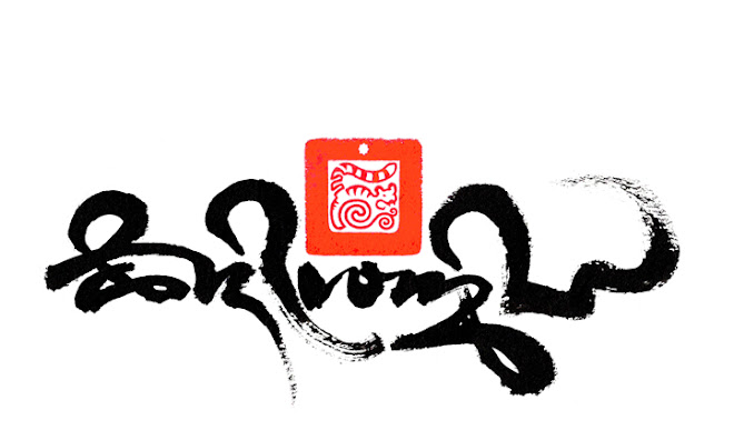
The words in the Tibetan Uchen script style translate as "sacred calligraphy", 57x76cm, Chinese ink on high quality water colour paper. © Tashi Mannox 2010.


Earlier this year the Contemporary Calligraphy Museum in Moscow invited Tashi to exhibit in their 2010 International Exhibition of 'Sacred' Calligraphy. This is to be held in the majestic Medieval City of Velikly Novgorod, considered one of the jewels in the crown of old Russia.

Below a short vide was also made as part of the exhibition 'interactive' which shows the process of creating the above calligraphy. A stage by stage demonstration, from the proportional layout in relation to the italic brush width, the application of the calligraphy to finish with the signature and 'chop' seal impression.


A more detailed explanation on the proportional construction of the Uchen script can be found here.

Sacred Calligraphy.
A short essay from the viewpoint of a Tibetan calligrapher, by Tashi Mannox.
The definition of 'mantra' is a sound or collection of syllables that are considered capable of transforming the relative to the ultimate mind.
Mantras are not just ordinary words written and spoken, but as they originate from an enlightened mind, such as a Buddha, they are considered sacred in their letterform and their quality of sound.
Historically the divine proportions of the syllables originated in ancient Sanskrit and later translated into other sacred languages such as Tibetan.
The Tibetan written language was developed to accommodate the migration of the Buddhist teachings from India, classified as Sutra and Tantra. The establishment and practice of these teachings was expressed in various art forms such as iconography and Calligraphy.
Because Mantras are considered sacred and symbolic of an enlightened mind, there is much respect and veneration involved. There is a set code of correct proportions of the syllables, which is, not just pleasing to the eye, but also having the effect of ‘liberation through sight’, connecting the viewer to what is ultimately pure. The same can be said for the sound of the mantra, which on a deeper ‘vibration’ level has a metaphysical effect addressing balance in the body and mind.
The act of writing a mantra can also be considered a meditation. Once a calligrapher is fully established in the formal tradition of a calligraphy style, relying on this discipline, allows confidence in the freedom of expression to manifest in the very moment of creating the mantra; the deliberation of the calligraphy is best approached with a mind free of any bias. Indeed such a meditative approach can be applied to any form of calligraphy.
What makes calligraphy sacred is not just a religious matter. The subject of the calligraphy should be from a divine source, the form of the lettering should be in respect to the spiritual tradition, and the approach in the creation of the calligraphy should be pure and meditative. This can then be called sacred calligraphy.
The effect of a sacred calligraphy piece is to lift and inspire the viewer, to cause intrigue to investigate further, to connect and awaken.
Tashi Mannox 2010.

Monday, 5 April 2010

Tibetan calligraphy in the Arab Emirates


Sharjah Calligraphy Biennial 2010

Sharjah is the third largest of the seven emirates that make up the United Arab Emirates; Abu Dubai is perhaps the more well known neighboring emirates state to Sharjah.
Sharjah boasts The Sharjah Calligraphy Museum’, being the only museum in the Arab world devoted entirely to calligraphy and located in one of the cultural capitals of the Arab world.
The Sharjah Calligraphy museum aims to instill the art of calligraphy in the people and visitors of Sharjah, to set new standards both locally and internationally. The Museum represents the Arabian heritage of Islamic calligraphy as well as other calligraphy traditions from around the world.
Earlier this year, Tashi was invited to participate their fourth international exhibition: Sharjah Calligraphy Biennial 2010, with this letter of invitation:

Dear Mr. Tashi Mannox,
Directorate of Art of Department of Culture & Information – Government of Sharjah is pleased to extend its greetings and would like to inform you of organizing the Fourth Session of Sharjah Biennial for the Art of Arabic Calligraphy for the period from 7 April to 7 June 2010, under the patronage of H.H. Sheikh Dr. Sultan Bin Mohammad Al Qasimi, Member of Supreme Council and Ruler of Sharjah, therefore, the higher committee is pleased to invite you with your distinguished works in this important festival.

Three major calligraphy pieces of Tashi’s are to show in the Sharjah calligraphy biennial 2010, the exhibition starts 7th April and runs until 7th June 2010.


One of the pieces shown at the Sharjah Calligraphy Biennial 2010: "Prosperity" 57x76 cm, ©


Saturday, 13 February 2010

Iron Tiger


Happy Losar !

Tibetan new year of the Metal Tiger.


Kagyu Tiger, From the Black-on-black series, Tashi Mannox 2008.
102x73 cm, mounted board, gold and silver leaf.

The three hum characters in gold, that ride the back of the tiger are the three essential syllables of the Dorje Drolo yidam practice, a wrathful manifestation of Guru Rinpoche, Padmasambava, practiced to overcome inner and outer obstacles.


May it be a year of Iron like strength, to accomplish all wishes swiftly as a tigers leap.


Click here to view a Losar 2010 good wishes from H.H. 17th Karmampa, Ogyen Trinley Dorje.


Sunday, 24 January 2010

Himalayan Festival


Here's a chance to see in the flesh a few of Tashi's Illuminated iconographic calligraphy pieces, Shown as part of London's first Himalayan festival.
Meet Tashi in person at the opening from 8pm Monday 8th February 2010 at the Nehru Centre, Mayfair.
Himalaya Exhibition combines art and photography to give an introduction to the cultural forces and trends flowing through the present-day Himalayan Region. It remains open from Monday 8th February until the end of the festival. Entry is free.
The landscape and peoples of the Himalaya show an infinite variety, but a young Singaporean photographer, Sam Kang Li, has gone further than most to document them all, having carried his camera through Nepal, India, Pakistan, Afghanistan, and even China. His striking photographs are rooted in humanity and tell us many stories of the Himalaya’s people. Cultural traditions from North and South of the mountains meet here, and this is evident in the work of the three young Himalayan artists who are showing their work at the Exhibition. Tashi Norbu hails from Bhutan, and Govinda Sah “Azad” and “Tene” Garbuja from Nepal. All have trained both at home and in Europe, and the work of each reflects a rich and diverse range of influences, from their native countries, from India, from Tibet, from the sacred and the secular, and from their life experiences. British artist Tashi Mannox is also contributing work to the Exhibition. Trained in Tibetan calligraphy, his beautiful paintings combine classical iconography and script with modern sensibility.


Wednesday, 6 January 2010

Creating black.


"Resplendent" 57x76 cm Chinese ink on Nepalese rag paper. Tashi Mannox 2009


There is a form of traditional Tibetan scroll Thang-ka ཐང་ཀ་ painting, which is applied to a black background, normally for the depiction of the more wrathful deities. A similar technique was also used in creating more elaborate Tibetan manuscripts, as out-lined in a previous blog.

The effect of illuminated imagery from a black base; has given Tashi's creative work a new dimension in the world of Tibetan calligraphy.

The creation for Tashi's black on Black series that features in his calligraphy website:Tashimannox.com is a technical affair of old and modern applications.

Technically, the first stage of a 'black' calligraphy is to paint a rubber masking fluid on the paper. Black ink is then applied, the rubber resisting the water based ink.


Once the ink is totally dry, the rubber mask can be carefully peeled away to reveal the clean white of the paper.


Any bright colours can then be painted in the white areas to give an illuminated jewel like brilliance. Other calligraphy is sometimes added with more black ink, giving the signature 'Black on Black' effect. The below image shows additional lettering in gold leaf, this is achieved by first painting a gold size directly onto the black background, then carefully applying Gold leaf.


"Five colored Hum" 57x76 cm, Dutch gold and acrylic paint on a black Chinese background, Nepalese rag paper, as part of the Black on black Tibetan calligraphy series, Tashi Mannox 2009. for a more detailed explanation on the meaning of this piece, including the translation, please visit here.


Friday, 18 September 2009

Capital of calligraphy


Merit of right action. 61x64 cm, Chinese ink ans Japanese mineral paint on a wash of pure saffron. Tashi Mannox 2009

The main body of text in the Dru-tsa script reads:

I fully abandon bad deeds,
but engage fully in all meritorious actions.
In the pure merit of all beings,
in all their virtuous deeds, i rejoice.

The smaller Petsug script is in reference to the composer of this wishing prayer, named Phag pa Lundrub. This calligraphy piece was especially commissioned by The Moscow Contemporary museum of calligraphy, july 2009.


In July 2009 the Contemporary museum of calligraphy in Moscow invited Tashi to join their body of participants of world class calligraphers. The 80 project participants have all contributed calligraphy master-pieces to the museums permanent and touring exhibitions. Tashi is the only contributing artist in Tibetan calligraphy and the only participant representing Great Britain.

The above calligraphy on saffron yellow, was especially commissioned by the Contemporary museum of calligraphy, for their permanent collection, This piece will be added to the sacred calligraphy section that also consists of Orthodox, Islamic and Judaism works. These pieces and more will feature in the sacred calligraphy collection of their 2nd International exhibition:


The II International exhibition of calligraphy

October 15 — November 14 2009
In 2009 Moscow became the capital of calligraphy, boasting the largest exhibition of calligraphy in the world.
It is where the Orient meets the West, professional artists speak to amateurs, classical calligraphy joins ultramodern art pieces. The exposition will feature art works from 33 countries: refined Slavonic and European calligraphy, traditionally reserved Japanese and Chinese creations, elegant scripts of the Hebrew and Arabic calligraphy schools.
The metropolitan audience has a rare chance to see valuable handwritten books, calligraphy masterpieces included in the Guinness World Records. Visitors may participate in mink-festivals of the Japanese, Tibetan and Slavonic cultures and visit calligraphy master-classes.
The exhibition is organized under the aegis of the Commission of the Russian Federation for UNESCO and supported by the Ministry for cultural affairs of the Russian Federation. Also the exhibition was officially recognized by the Russian Orthodox Church, the Russian rabbinate, Russian Council of Muftis and Buddhist organizations. This all emphasizes the special significance of the coming event for the cultural heritage.
From October 14th 2009 walls of the unique 4,000 sq.m. “Victory” pavilion will host art pieces of 100 calligraphers from 33 countries. Near 200 calligraphy master-pieces will be demonstrated for the first time.


Also, on lone to the calligraphy museum, is a selection of Tashi's other calligraphic works, these include a piece each from his Contemporary Tibetan, Black on Black and Illuminated iconographic series. These will be shown until 2014, on a touring exhibition that will be held in the words leading cities, starting with Paris.

More details of Tashi's contribution of pieces to the museum can be seen here.


Causality

57x76 cm, Chinese ink on heavy water-colour paper, Tashi Mannox 2009

One of the pieces on lone to the Moscow contemporary museum of calligraphy.


Another blog worthy of a visit, which could be said to be the most bang-on and informative Buddhist blog ever created. Please take some time to visit the "Digital Tibetan Buddhist Alter" who recently sang the praises of Tashi.


Wednesday, 12 August 2009

The heading character and Script construction.


The illustration shows six variations of the Uchen script style 'heading' character. 


© Tashi Mannox 2010


1, single. 


2, double. 


3, treble. 


4, resembling water birds. 


5, owl eyes 


6, an elaboration using two 'Ha' syllables.


On every beginning of a Tibetan page of text or title is found the characteristic swirl symbol, this is known as the ‘heading’ character, its job is to announce the start of the text it prefixes. It is not a word as such but a symbol, which is as much decorative as functional. As with the letters of the Uchen alphabet, the heading character is constructed using a particular system of proportion.


The heading character is commonly scribed as two swirls. This is described as resembling the nose of a snake, whereas a single heading character is described as the horn of a rhinoceros. Less commonly, is a treble heading character, which used at the very start of major text.
There are many stylistic variations of the heading character, historically and from the location the script derives. Besides the Uchen script, each of the different Tibetan scripts has its own styled heading character to suit.
The heading character in the Uchen script style is finished with a single vertical down stroke, called ‘Shay’ in Tibetan. This is also used as a sentence divider and a stop. At the very end of a large piece of text or important title, there is often a double stop stroke. A different smaller triangular dot is used to separate the words.


The correct proportion for writing the Uchen script is to calculate the size of the letters in accordance to the size of the pen nib used.
First, horizontal lines are scored on the paper. The distance between the lines is determined by doubling the italic pen nib size to make one part. There is a 3x3 part grid as a guideline for the top portion of the letters and another equal in size for the bottom tails of the longer letters. This is demonstrated in the image above, showing the first four and last three of the Tibetan alphabet letters in relation to the proportion lines.
The application of the letters to the score guidelines always starts with the first stroke of the letter across the top, from left to right. This is called the head of the letter. According certain letters, the head may differ from Long to medium to short in length.
The construction of a letter then follows with separate down strokes. Each different letter has its own particular order and direction of application. Names are given describing the different strokes, such as shoulder, chest and leg.


The object in creating a good Uchen script is to be as straight and neat as possible, all the letters should be hanging from the same straight line, with curved strokes well formed and rounded. Vertical ‘leg’ strokes should be thicker at the top and to a fine point at the bottom end; this is achieved by twisting the italic pen on the down stroke. There should be good contrast between the thick and thin lines throughout the letter. All down strokes should end in the same manner. The scored lines help to achieve this discipline and uniformed appearance.
The above image shows the heading and Uchen script at an acute angle to highlight the uniformed alignment of the letter strokes.


Here shows an elaborate 'high' version of the Dru-tsa script according to the precise grid guide-line, as with the Uchen script, the size of the grid score lines are determined by the size of the italic pen nib used. The proportions of the score lines are such to allow the flow and grace, typical of the Dru-tsa calligraphy style. The smaller red Uchen script translates the Dru-tsa script as "the command of the beautiful letter form".


An example of a text page in the Uchen script style. The front side of this well thumbed page is identified buy the heading character, the back side of the text page has no heading character, this has a practical use, considering the pages of a Tibetan text are all loose.

For a basic history of the different Tibetan scripts listed and their usage, please visit the Scripts and conservation page.

All the above images are created by Tashi Mannox in accordance with the traditional methods of proportion of the Tibetan writing systems. © Tashi Mannox 2009.