The illustration shows six variations of the Uchen script style 'heading' character.
 |
| © Tashi Mannox 2010 |
1, single.
2, double.
3, treble.
4, resembling water birds.
5, owl eyes
6, an elaboration using two 'Ha' syllables.

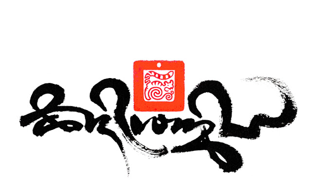
On every beginning of a Tibetan page of text or title is found the characteristic swirl symbol, this is known as the ‘heading’ character, its job is to announce the start of the text it prefixes. It is not a word as such but a symbol, which is as much decorative as functional. As with the letters of the Uchen alphabet, the heading character is constructed using a particular system of proportion.
The heading character is commonly scribed as two swirls. This is described as resembling the nose of a snake, whereas a single heading character is described as the horn of a rhinoceros. Less commonly, is a treble heading character, which used at the very start of major text.
There are many stylistic variations of the heading character, historically and from the location the script derives. Besides the Uchen script, each of the different Tibetan scripts has its own styled heading character to suit.
The heading character in the Uchen script style is finished with a single vertical down stroke, called ‘Shay’ in Tibetan. This is also used as a sentence divider and a stop. At the very end of a large piece of text or important title, there is often a double stop stroke. A different smaller triangular dot is used to separate the words.

The correct proportion for writing the Uchen script is to calculate the size of the letters in accordance to the size of the pen nib used.
First, horizontal lines are scored on the paper. The distance between the lines is determined by doubling the italic pen nib size to make one part. There is a 3x3 part grid as a guideline for the top portion of the letters and another equal in size for the bottom tails of the longer letters. This is demonstrated in the image above, showing the first four and last three of the Tibetan alphabet letters in relation to the proportion lines.
The application of the letters to the score guidelines always starts with the first stroke of the letter across the top, from left to right. This is called the head of the letter. According certain letters, the head may differ from Long to medium to short in length.
The construction of a letter then follows with separate down strokes. Each different letter has its own particular order and direction of application. Names are given describing the different strokes, such as shoulder, chest and leg.

The object in creating a good Uchen script is to be as straight and neat as possible, all the letters should be hanging from the same straight line, with curved strokes well formed and rounded. Vertical ‘leg’ strokes should be thicker at the top and to a fine point at the bottom end; this is achieved by twisting the italic pen on the down stroke. There should be good contrast between the thick and thin lines throughout the letter. All down strokes should end in the same manner. The scored lines help to achieve this discipline and uniformed appearance.
The above image shows the heading and Uchen script at an acute angle to highlight the uniformed alignment of the letter strokes.

Here shows an elaborate 'high' version of the Dru-tsa script according to the precise grid guide-line, as with the Uchen script, the size of the grid score lines are determined by the size of the italic pen nib used. The proportions of the score lines are such to allow the flow and grace, typical of the Dru-tsa calligraphy style. The smaller red Uchen script translates the Dru-tsa script as "the command of the beautiful letter form".

An example of a text page in the Uchen script style. The front side of this well thumbed page is identified buy the heading character, the back side of the text page has no heading character, this has a practical use, considering the pages of a Tibetan text are all loose.
For a basic history of the different Tibetan scripts listed and their usage, please visit the Scripts and conservation page.
All the above images are created by Tashi Mannox in accordance with the traditional methods of proportion of the Tibetan writing systems. © Tashi Mannox 2009.
This is amazing! Thanks for sharing this. Peace!
ReplyDeleteThis is very informative and useful for learning about how Uchen script is constructed, particularly the proportions of the letters. It's got me thinking about my own script (derived from Takri, but entirely different in look), and how it should be proportioned using an angled pen.
ReplyDeleteas a student of linguistics your work is both beautiful and fascinating (and thus all the more beautiful) to me. Thank you for including such detail in all you do.
ReplyDeleteI am happy that at least somebody gave this subject an attention. People should understand its importance as well…thanks for sharing this with me!@bose
ReplyDeleteLetters