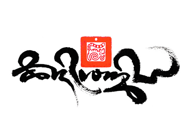
In March 2015, the eldest son of the former Akong Tulku Rinpoché, Jigme Tarap requested Tashi Mannox to come up with a logo design for the newly formed Akong Rinpoché Foundation, set up to continue the noble work of the 2nd Akong Tulku, and aid support in Northern India, Nepal and the Tibetan homeland, especially Akong Rinpoché's seat monastery in Eastern Tibet, Kham called Dolma Lhakang.
"Since my fathers sudden departure from this world, we his family, more than ever appreciate the work he has been doing to help others throughout his lifetime.
It is through his selfless dedication to help others that we have set up the Akong Rinpoché Foundation" - Jigme Tarap.
Several different designs were created from which one was chosen and approved with the blessing of H.E. Kenting Situ Rinpoché.
As a close disciple of Akong Tulku, Tashi explains the logo designs below:
These designs are all quite simply based on Akong's name: ཨ་དཀོན་ which has a very deep meaning. His name will always be given through all of his incarnations, so it is very significant and long lasting, therefore applicable to his new incarnation too.
ཨ་is the root letter of the Tibetan alphabet, that also signifies primordial awareness that is essential to the Nyingma tradtion that he is a lineage holder.
དཀོན་ means sacred, dear, precious, which he is to us of course. within the spelling of this word is the latter ཀ་ which is the first letter of the Tibetan alphabet and the letter/symbol of the Kagyu tradition, that he is also a lineage holder, and even said to be an emanation of Karmapa which also uses the same letter ཀ་ in the essential spelling of Kagyu.
The dominant quality of Rinpoche was his strength, he was a pillar of strength and stability for all of his students, this is why I stacked the word Akong one unit below the other, it stands like a strong tower and nicely balanced that gives stability. I have also stylised these letters to look both strong yet elegant, which was also the qualities of Akong Rinpoche.
The different coloured letters also refer to his activity of body speech and mind of white red and blue, as shown in the final design at the top of this post.
Framed in a circle gives a classical perhaps contemporary feel.
Then we could add a canopy at the top, that denotes the importance and sacredness of the word Akong, this is perhaps more typical traditionally Tibetan, but then Rinpoché was very traditionally Tibetan.


