RELATED TIBETAN SCRIPTS

Wednesday, 2 February 2011

Many Mani Digital

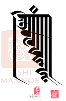
The Mani mantra © Tashi Mannox 2000


Shortly after leaving the monastery at the dawn of the new millennium; Tashi put his brush to paper and created a calligraphy of the Mani mantra, oṃ maṇi padme hūṃ. an obvious topic choice for a calligraphy considering the meaningful depth of the Mani mantra and the blessing it so powerfully exudes, equally so, the form of the letters were a test of his abilities to create well with a brush, a challenge that engages Tashi until this day.

Entering the digital world with Tashi's first website in 2002, he published the above piece as part of his art collection, little did he know the extent to which this particular image has been copied and reproduced, published on multiple blogs and websites, often unknown by the authors who the original creator of the image is. It seems it has become a popular example of the Mani mantra, admired by many and quite righty so, as it is said that by merely seeing or hearing the Mantra creates an auspicious connection to what is ultimately pure. (see Pure Perception)


The Mani mantra © Tashi Mannox 2005


By 2005 Tashi had created other calligraphy pieces of the Mantra, one of which as a workshop demonstration and explanation of it's meaning during his 're-newal' exhibition in New York City 2002, this piece was sold while the ink was still wet on the paper.
While in South Italy in 2005, Tashi created the above calligraphy, which perhaps a little more orderly than his first attempt in 2000. This image was published on the well known 'Visible Mantra' website in 2007 and has since become top of the list when searching for images of the 'Mani mantra' in a web browser, this has also become a popular reproduced image.


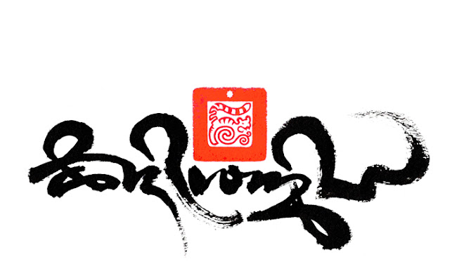
The Mani mantra © Tashi Mannox 2010


More recently in 2010, Tashi created the above calligraphy of the Mani mantra with the addition of the seed syllable hri. 


Thursday, 27 January 2011

The Mani Mantra


The Mani mantra of Avalokiteśvara arranged on a lotus Mandala.
Each of the letters are placed on each petal starting at the bottom
(Easterly quarter) running clock-wise:
oṃ ma ṇi pad me hūṃ 
In the center of the mandala is the seed syllable hri
Copyright Tashi mannox 2018 

"Mani-wood" The famous Hollywood sign adapted by Tashi July 2009.


It is said that on seeing the form of the Mani mantra, to hear the sound of the Mani mantra: oṃ maṇipadme hūṃ is to purify and liberate from the un-enlightened state of ignorance.


The meaning of the Mantra by His Holiness the Dalai Lama:

"It is very good to recite the mantra oṃ ma ṇi pad me hūṃ but while you are doing it, you should be thinking of it's meaning, for the meaning of the six syllables is great and vast. 
The first, oṃ is symbolic of the pure exalted body, speech, and mind of a Buddha. maṇi means jewel, symbolizes the factors of method-the altruistic intention to become enlightened, through compassion and love. padme meaning lotus, symbolizes wisdom. Just as a lotus grows from the mud, but is not sullied by the faults of mud, so wisdom is capable of putting you in a situation of non-contradiction whereas there would be contradiction if you did not have wisdom. ...Purity must be achieved by an indivisible unity of method and wisdom, symbolized by hūṃ which indicates indivisibility...
Thus together these syllables mean that in dependence on the practice of a path which is an indivisible union of method and wisdom, you can transform your impure body, speech, mind into the pure exalted body, speech, mind of a Buddha."

The practice of the Mani mantra and how to integrate pure perception on a spiritual path is explained further here.

In Tibet, whole hillsides are seen as a great opportunity to plot out huge images of the sacred mantra, often with white stones. Such constructions are believed to emanate  blessing across the land, if not as a constant reminder of the mantras sacred and positive meaning.


A enormous Mani mantra in East Tibet.

The mantra was also commonly carved on flat stones and piled up in great heaps that sometimes stretch for a mile or more. As an act of respect, a person would always pass with the mantras on their right, circling clock-wise.

Other such devotional activities, such as hand spinning prayer wheels filled with mantras minutely printed on tight coils of paper, is considered that with a good intention and the act of turning the wheel, the power of the mantra is activated, similarly mantra printed prayer flags utter their prays caught on the wind.

In our modern times the sacred Mani mantra could not be more applicable in meaning and benefit. For the meaning of the Mani mantra is steeped in Loving-kindness and understanding, each of the six syllables purifying and converting negative emotions into wisdom, which is a fundamental basis to our confused state of being, that transformed; can only lead to a happy state of mind.


A modern electric powered prayer wheel,
made by the Father of Tashi: Peter Mannox
precious jewels decorate the rings of the drum
between which the Mani mantra is illuminated
in gold Lantsa Sanskrit lettering.

Our modern world also allows prayer wheels to be driven by electricity. The prayer wheel pictured above, housed at the Samye Ling Temple in Scotland, contains billions of Mantras on micro film. For every one rotation of the wheel; there are seven Mani mantras dedicated to each Human being on the planet, the praying wheel turns continually day and night.


The earliest written version of the Mani mantra is know in the Lantsha and Wartu Sanskrit forms, used by Buddhist monks in India and Tibet in the 11th century.

The mani mantra in the ancient Wartu or Vartu Sanskrit.

© Tashi Mannox 2022

Lantsha Sanskrit Mani mantra.

© Tashi Mannox 2022


The beginning of the Tibetan written language was developed to accommodate the  migration of the Buddhist teachings from India to Tibet. The original Indian manuscripts were scribed in both Lantsha and Wartu, these were fundamental to the Buddhist textual tradition and very much their visual identity. Indeed Lantsha and Wartu is still today considered a sacred and classical written language, which is often upheld; painted and gilded high up on Tibetan temple walls, beams and pillars.
The Mani mantra arranged as a monogram, a very
condensed and convoluted form of
Lantsha Sanskrit called Kutaksyar.
© Tashi Mannox 2022

As the written form of a mantra is considered divine, there was much care and respect when translating Sanskrit to Tibetan. Moreover, most mantras where translated phonetically into Tibetan, maintaing as near correct as possible to the original quality of sound, which is considered integral to the meditation practice they belong to.

The classical Uchen script style is perhaps the most common and recognizable of the Mani mantra in Tibetan, a script style very similar in appearance to Sanskrit to an untrained eye,  so it is somewhat understandable that the Uchen style is often miscalled 'Tibetan Sanskrit'.
The Mani mantra is an early form of Tibetan called High Uchen

© Tashi Mannox 2022
Below follows a list of the Mani mantra in the main Tibetan script styles, these are shown without the traditional 'heading character' the addition of a heading character dose not change the meaning of the mantra, for more explanation on the heading character.

A more standard version of the Mani mantra in the Uchen script.

© Tashi Mannox 2022 


The Mani mantra in a short form called Tsugtung

© Tashi Mannox 2022

A script style derived from East Tibet, Kham, called Petsug or Khamyig

© Tashi Mannox 2022

A more cursive script form called Dru-tsa

© Tashi Mannox 2022

A quick style of hand-writing called Khyug

© Tashi Mannox 2022


The Mani mantra in three scripts,
From left to right:
vertically stacked in Uchen
Horyig seal script
Phags-pa

© Tashi Mannox 2022

The Horyig and Phags-pa scripts are related to Mongolian and where developed for the use of seals across Mongolia Tibet and China. A more in-depth explanation on the Phags-pa script is shown here, and for the Horyig script please click here.

The Mani mantra has in recent times become popular as a tattoo design. Because the mantra is a sacred word, there are advised guidelines as where and where not to place the mantra, this is not only to safe-guard the mantras integrity but also to curb any negative karma to others and ones self in miss-placing the mantra, such as up-side-down or back-to-front.

Many of the above mantras and more are available as high resolution downloadable images from the Tashi Mannox on-line store.


Wednesday, 19 January 2011

Opportunity


Life is an opportunity. 


Opportunity

Acrylic paint on heavy water colour paper, 57x76cm 2007


The words ‘seize the moment’ in the Tibetan Dru-tsa script is depicted wrapped with the stems and leaves of five different coloured lotus flowers. 
Each of these flowers represent the Five Buddha families. The analogy of the five flower buds is the opportunity to transform the five negative emotions, pride, attachment, anger,  jealousy and stupidity, into the five wisdoms represented in the manifestation of the Five Buddha families and their corresponding colours.  
As any plant that will take root and blossoms in slightest of conducive conditions, its leaves hooked and curl to grab as opportunists, just like every moment of life with the experience of karmic fruition, is an opportunity to take hold and transform a negative situation into a positive advantage. 


༄། དལ་འབྱོར་འདི་ནི་རྙེད་པར་ཤིན་ཏུ་དཀའ། སྐྱེས་བུའི་དོན་སྒྲུབ་ཐོབ་པར་གྱུར་པ་ལ། གལ་ཏེ་འདི་ལ་ཕན་པ་མ་བསྒྲུབས་ན། ཕྱིས་འདི་ཡང་དག་འབྱོར་པར་ག་ལ་འགྱུར།།


This free and well-favoured human form is difficult to obtain.
Now that you have the chance to realise the full human potential

If you don’t make good use of this opportunity,
How could you possibly expect to have such a chance again?
Shantideva: Engaging in the Conduct of a Bodhisattva, I, 4


A detail showing the fine brush work shading, a technique used in
traditional Tibetan Thanka painting.


Tashi is pleased to announce that this illuminated calligraphy called "Opportunity" is now available as limited edition prints of a large size of 67x50cm and a half size of 50x37 cm.

These excellent quality reproductions are premium-quality giclée printed, on mould-made papers (the finest and oldest paper-making technique) of 310-315 g/m². The papers; Velin and Aquarelle 100% rag, are of museum conservation standard, ensures stability and UV colorfast ink longevity of more than 120 years.

Each image is carefully colour matched and in sharpness to the original artwork. The prints are hand signed and stamped with the artists’ personal ‘water tiger’ seal. 

Other prints available from the collection of Tashi's works with their current prices are listed on the link here.


Tuesday, 18 January 2011

Inspiration


i-D is not just a fashion magazine, it addresses much more humanistic issues, such values: to open our eyes, beyond price, to learn and pass it on, family future positive, Soul and for inspiration: see Tashi Mannox, SOUL i-D edition 10. 


Tashi said "this is a wonderful magazine that has inspired me for many years. Now i-D finds inspiration in my work, how amazing! i would never have imagined the day, i feel humbled".


Tashi as a young monk dreaming the day he would make the cover of i-D


Saturday, 18 December 2010

Tibetan script styles


དབུ་ཅན་དང་དབུ་མེད།


A sample of a woodblock print showing both Uchen and Lantsa Sanskrit, the original script style of the Buddhist manuscripts of India in the 6th century.

Perhaps the most well known Tibetan script style in the West is the classical Uchen script དབུ་ཅན། recognisable by it's distinct angular appearance, especially in the straight heads of the letters that align horizontally; from which the rest of the letter hangs down from.
The name Uchen translates as 'with head', as apposed to another class of Tibetan script styles 'without head' called Umé དབུ་མེད།


དབུ་ཅན།

A page from a Sutra, illuminated in gold hand-painted Uchen lettering on a polished indigo/black stained paper. Traditionally it was considered a meritorious act of reproducing sacred scriptures as well as a way to preserve the 108 volumes of the Buddha’s teachings 'Kangur’ and the 224 volume commentaries 'Tengyur’ to both the ‘Sutras’ and ‘Tantras’. These vast manuscripts were often copied in pure gold ink by highly skilled scribes and held in the monasteries as treasures of veneration and as a symbol of the holy dharma


Historically the Uchen script style was developed to accommodate the translation from Sanskrit and the reproduction of the Buddhist teachings that migrated from India into Tibet around the 7th century A.D.  
As Buddhist literature was commonly reproduced in Tibet as wood block prints, the Uchen script was further adapted to lend its self as a more practical script style for hand carving the wood blocks. Because of this employment of the Uchen script; it is sometimes known as 'block script', which also describes its angular appearance, very much as a result of the nature of wood carving.

Woodblock printing Tibetan manuscripts, this ancient form of printing is still being practiced at the famous printing house in Dege, East Tibet.


Although Uchen is known as the classical script style and has an important role in Tibetan Buddhism, there are far less Tibetans that actually write Uchen. Tibetan handwriting is more practically practiced with the faster cursive Umé class of styles, as apposed to Uchen which takes much more care and time to construct.


"The Four Noble Truths" 

Japanese mineral paint on Bhutanese Tsasho bark fiber paper, 58x80 cm 


Above is a clear example of a hand painted Uchen script, this particular style is a 'high' form of Uchen, used mostly for the head page of illuminated manuscripts, this style derives from a text of the 15th-16th century from the great Tsurphu monastery in central Tibet, famously known as the seat monastery of the Karmapa's.


དབུ་མེད།
There are many different forms of the Umé scripts, when learning Umé there is a specific chronological order, from the more uniformed constructive forms called Tsugring ཚུགས་རིང། meaning long form and Tsugtung ཚུགས་ཐུང་། meaning short form, to the more cursive styles གཤར་མ། of which there is the every-day writing styles of Khyug dri འཁྱུག་བྲིས། meaning nimble writing and Kyug dri རྒྱུགས་བྲིས། meaning quick writing.
There are other intermediate script styles བར་བྲིས། such as Tsugmakhyug ཚུག་མ་འཁྱུག། a sub style between Tsugtung and Khyug yig. Petsug དཔེ་ཚུགས། often used for hand-written texts and books, of which is traditionally associated with different regions of Tibet, such as the Khamyig ཁམས་ཡིག། a script style referring to the Eastern Provence called Kham.
For the more artistic form of calligraphy Drutsa འབྲུ་ཚ། is used, this script style is particularly flamboyant and cursive in style, traditionally used for official documents and titles.


In old Tibet the monasteries where the great power houses of learning, they provided education starting at a young age, a number of schools and universities could be found within the grounds of the larger monasteries, where learning to read and write the Buddhist scriptures was an important part of the monastic education.


ཚུགས་རིང།
The first script style to be mastered is Tsugring or sometimes spelt sugring སུག་རིང། meaning long limb, indicating the distinct character of this script style as long height of the letters.
Much practice with a steady hand is needed to pull the long tails or limbs of the letters to a straight unwavering vertical line. As paper was an expensive commodity in Tibet, young monks practice on slates or black painted wooden pallets called "Jangshing", these are marked with construction lines at the desired proportion, then dusted with chalk.
A bamboo cut pen is then dipped into water, the letters are then marked through the chalk dust, to be practiced over and over re-chalking the pallet each time.

A young Tibetan monk practicing the Tsugring handwriting style, Photograph courtesy of Shannon O'Donnell.

Once the Tsugring script style is mastered, then the student moves onto the next script style of Tsugtung, (a shorter form of Tsugring) accomplishing each style respectfully; until the more quick/swift Khyug script styles are achieved, only then may a student be inclined to learn to write the Uchen style.


Corresponding script styles of the first five letters 
with the four vowel signs of the Tibetan alphabet


Here below is the first part of the Alphabet in the Tsugring script is shown with the construction lines as a guide for neat handwriting and to give the correct letter proportion.

The correct proportion of the Tsugring letters is determined by the thickness of the pen nib, 
this measures as 'one' unit, the main body of the letters is made up of two parts of 4 units, 
totaling 8, the long tails of the letters is a further 11 units.

ཚུགས་ཐུང་།
Tsugtung is similar to Tsugring in style, the main difference is that the letter height is overall shorted.


ཚུག་མ་འཁྱུག།
Tsugmakhyug is a sub script style that sits between Tsugtung and Khyug. It has a less formal appearance, with a more rounded letterform and shorter vowel signs.


དཔེ་ཚུགས།

The next script style is Petsug ,often used for the publication of books, as this script style has a distinctive short angular style with short vowel signs, this means that the lines of text can be placed closer together. It was commonly used in the Kham Province of East Tibet, which lends it another name Khamyig, meaning ‘writing of Kham’. 


འབྲུ་ཚ།
Drutsa is the most cursive of the Tibetan script styles, because of this it is used generally for artistic calligraphy. Perhaps more feminine in appearances, the rounded forms of the letters can be exaggerated and flourished to fit all shapes and orientations.


འཁྱུག་བྲིས།
Khyug is known as the quick writing style, used for swiftness needed for normal handwriting. Its cursive form with vowel signs that stand up freely yet joined up to the main body of text, means that a separation of a different colour is not easily possible.