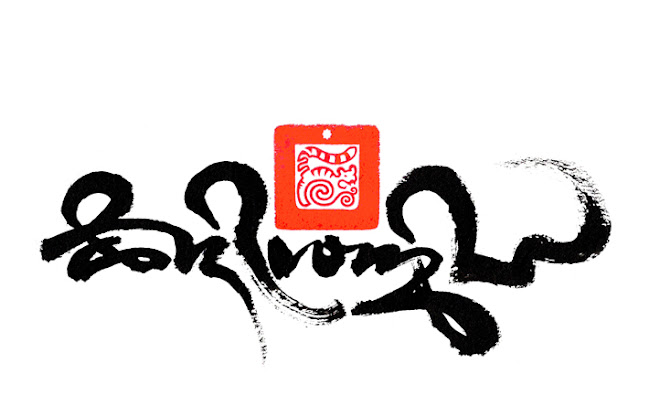
RELATED TIBETAN SCRIPTS

Thursday, 15 March 2012

Homage manuscript


This delightful manuscript is a multi scriptural and colourful display which pays homage to His Holiness the 14th Dalai Lama bsten 'dzin rgya mtsho བསྟེན་འཛིན་རྒྱ་མཚོ། Perhaps dating from the midd 20th century, the scroll was written and presented by the monastic community at Dongrub Ling below the Himalayan town of Kalimpong, which was the last Indian trading post before Tibet on the historic silk route through to China. 


The coloured canopy ornamentation called sgo Khyim སྒོ་ཁྱིམ་ incorporates the eight auspicious symbols with drapes and tassels, is traditionally placed above important titles and verses, which in this case are composed of four lined poem in praise of the Dalai Lama. These are repeated in five different script styles, which from top to bottom are 
1. Lantsa Sanskrit, 
2. Wartu Sanskrit, 
3. Tibetan Uchen phonetics and 
4. Tibetan translation in a high form of Drutsa script, flanking each side is 
5. the vertical Horyig script that is translated from the Tibetan translation. 


The above image shows the full length of the scroll that the majority script is an Umeh form called Tsugtung or Tsugmakhyug, a quicker hand writing style that is attractively uniformed with long flourished vowel signs.


An enlarged detail of the end of the manuscript shows that certain key words have been inked in red, which is often used to highlight a name of even to string together a hidden sentence of significant meaning relating to the content of the document. 


Sunday, 4 March 2012

Taking Refuge


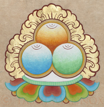
For Buddhists and especially Tibetan Buddhists, the three fold refuge ‘Buddha, Dharma and Sangha’ is known as ‘The Three Precious Jewels” དཀོན་མཆོག་གསུམ། 
This is typically illustrated as above and at the top of the below calligraphy art piece; as three round precious jewels seated on a moon disk and multi-coloured lotus flower, the three jewels are decorated with a radiating golden leaf like pattern.


To take refuge is to simply put ones trust or confidence in those who have fully liberated them selves from 'samsara' such as a Buddha, by following the Dharma teachings with the guidance of the Sangha on the path to enlightenment. Until i am free from confusion and suffering, i take refuge in the Buddha, Dharma and Sangha.


The Threefold Refuge:

"Homage to the Three Jewels" 57x84 cm  Tashi Mannox 2012.
Available as a limited edition print.

The above calligraphy art piece illustrates from top to bottom four classic calligraphy traditions of India, Tibet and Ireland:

~ Sanskrit Lantsa that reads namo buddha ya, namo dharma ya, namo sangha ya.
The Buddhas teachings were originally transcribed in Sanskrit belonging to India, that has evolved over the centuries into many different forms of script styles. Lantsa was a very early such style that many of the Buddhist manuscripts were created in. It was these Lantsa manuscripts that migrated into Tibet and formed the bases from which the Buddhist teachings where first translated into Tibetan.

~ Tibetan Uchen script this is a phonetic translation of the above Sanskrit that also reads as namo buddha ya, namo dharma ya, namo sangha ya.
It is said that the Uchen script style was evolved to accommodate the translation of Sanskrit manuscripts from India, indeed there are some similarities in construction and letter forms, though Tibetan is a totally different language to Sanskrit, many original Sanskrit terms and mantras where maintained phonetically in Tibetan, as to preserve the original sound and to up-hold what was considered a sacred language, such as Latin is to Christians. 

~ Petsug script that is a translation of the above in Tibetan that reads sange la chag-sal lo, chö la chag-sal lo, gendun la chag-sal lo, meaning to bow down with folded hands to the Buddha, Dharma and Sangha. 
Petsug is one of many handwriting styles of Tibetan calligraphy, quicker to form than the Uchen script, it was commonly used to scribe manuscripts. 

~ Celtic English script that is a translation and phonetics of the original Sanskrit.
Perhaps a sacred English script; historically the great Christian manuscripts were scribed in Celtic scripts, which did not belong only to Ireland as we know it today, but the Celtic Christian influence spanned over Scotland, Wales, England and into Europe. 

Created for an exhibition in December 2012 at the Contemporary Calligraphy museum in Moscow. Chinese ink and Japanese mineral paint, 23.6ct gold leaf on Bhutanese tsasho paper,  Tashi Mannox 2012.


"homage mudra" 48cm diameter,  Tashi Mannox 2012.  


Another new piece by Tashi Mannox is to illustrate the 'mudra' of folded hands at prayer, painted in the way of traditional Thanka draftsmanship, there is a modern twist of folded back Western shirt sleeves and wrist watch on the traditional depicted arms and hands. 
Mudra means 'gesture' above the gesture of prayer is the word 'namo' meaning homage, this is in the Sanskrit Wartu script painted in a Japanese mineral earth red, below which in Tibetan Tsugmakhyug script translates as "hands held together at the heart in the gesture of prayer".


The Fourfold Refuge:

"Homage the the Fourfold Refuge, 54x84 cm
 Tashi Mannox 2012. 
Available as a limited edition print.

The main body of calligraphy of the above Four Refuges piece is painted in a historic 'high' form of Uchen, inspired by a 16th century manuscript from the seat monastery 'Tsurphu' of the Karmapa Lama's in central Tibet.
The Four Refuges: 'Lama, Buddha, Dharma and Sangha' are highlighted in rust red mineral paint. 

The first dark maroon characters 'na mo' in the Lantsa Sanskrit script translates as 'homage' at the end of the prayer is a 'full stop' character in the same Lantsa Sanskrit script.
The smaller lettering in red also at the end of the refuge prayer, translates as "the four fold refuge" 


In the Tibetan Buddhist system the Lama or Guru has become an equaled source of refuge, who a realized personal known as a 'root' teacher who has the ability to guide and point out the nature of ones mind, is called a Lama. 

Private collection. Chinese ink and Japanese mineral paint on Bhutanese Tsasho paper Tashi Mannox 2022.


Sunday, 26 February 2012

Punctuation treasures


'The indivisible unity of means and wisdom'
Chinese ink and mineral paint on Bhutanese  tsasho bark fiber paper, soaked in vermilion orange Japanese ink.  
35x52cm. ⓒ Tashi Mannox 2022.

The above art piece features a sign; made up of two small circles and a crescent moon shape ༔ is known in Tibetan as a Ter-tseg གཏེར་ཚེག་ When used as a punctuation mark at the end of a line of text or mantra, this tells us that the origin of the mantra or manuscript is a spiritual treasure called a Terma གཏེར་མ་ hidden by Guru Rinpoche or Yeshe Tsogyal for the benefit of future generations. 

A Terton is a title given to a spiritually realized person of the Guru Rinpoche linage who has the ability to discover or reveal Terma.

According to the vision of Terton Taksham Nuden Dorje, it is said the two circles symbolize means ཐབས་ and Knowledge/wisdom ཤེས་རབ་ and the crescent moon between them represents their indivisible unity ཟུང་དུ་འཇུག་པ། Although the Ter-tseg as a punctuation mark can also be written as only two ཿ circles without the crescent moon, such as Terma manuscripts from Mindrol Ling.
In the case of a Tibetan manuscript that is not a Terma, the ending of each line of text or mantra is a single vertical stroke called a shad ཤད་ = ། 

The Ter-tseg sign can also be called namche རྣམ་བཅད་ However, identical in appearance, it plays a different role in Tibetan scriptures. The namche has its origins in Sanskrit as two dots and can usually be found suffixed to singular syllables, such as the Sanskrit syllable hrīḥ ह्रीः Which in the Tibetan phonetics is written ཧྲཱིཿ 
In Sanskrit the two small circles called a visarga, has the effect on the root syllable of changing the pronunciation with a light out breath, that has been somewhat lost in the Tibetan pronunciation.

An example of the uses of both Ter-tseg and namche within the Tibetan written language is with the mantra of Guru Rinpoche, as shown below. Two circles are present with the second syllable of the mantra ཨཿ which originates from Sanskrit. The Mantra is then finished with a ter-tseg ༔ announcing that the mantra is of Terma in origin.

ཨོཾ་ཨཿཧཱུྂ་བཛྲ་གུ་རུ་པདྨ་སིདྡྷི་ཧཱུྂ༔


With thanks to the knowledgeable Jayarava for contributing to this short post.


Saturday, 25 February 2012

Iconographies of Dharma

Photograph by Rebecca Von Ommen. 

Michael Schwartz writes:
Integral Calligraphy

Calligraphy is the art of beautiful writing, the art of exquisite hand-written linguistic marks. Such is the aesthetic impact of the script that the verbal meaning need not be understood for the calligraphy to shine forth in profound significance.

Many world-historical cultures have evolved ramified calligraphic traditions, perhaps most well-known being those of Asia and Islam. Less popularly acknowledged amongst the Asian traditions, Tibet has its own remarkable lineages of calligraphy.

Tashi Mannox, an Englishman, and for many years an ordained Buddhist monk, has trained for decades in the arts of Tibetan calligraphy. Today he preserves this tradition as a vehicle to communicate and transmit dharma, all the while adapting and updating his approach within and for contemporary contexts. He identifies three streams in his work: (1) contemporary and traditional; (2) contemporary black on black, and (3) illuminated iconography.

In honoring contemporary contexts and concerns, some of his designs are presented as sacred tattoos. With certain commissioned work he offers the option of including bespoke seals that are specific to the calligraphic project and its patron. In all cases Tashi's art is an expression of his long and devoted meditative practice and spiritual realization, such that his art energetically transmits the Tibetan Buddhist View.

Several of the circular designs in the present exhibition approach the status of calligrams—the arrangement of script to form a picture—a device most often associated with strains of Islamic artistic practice and with experiments in Western modernism aligned with the poet Guillaume Apollinaire. A work like Emanate from Emptiness and Samsara—Cyclic Existence visually articulates the verbal meaning in a picture-like manner, amplifying rather than compromising the calligraphic beauty and integrity of the script itself. Indeed, the variety of Tashi's approaches is astonishing. With a work like Primordial Purity, Golden World, the pictorial is no longer built up from the script, but is an image in its own right, aspects of the script incorporated then meaningfully and expressively into the image. With Hum, Jyo-Protection, the mark-making itself is of a refined exquisite delicacy, the script streams and seals composed on the page to generate extraordinarily aesthetic coherence and expressive nuance.

Grounded thoroughly in the pre-modern Tibetan tradition, incorporating modernist visual schemes, and being multi-cultural and postmodern in drawing on other calligraphic lineages such as the spatial awareness proper to Zen calligraphic practice (while preserving the Tibetan core of style), Tashi Mannox's art is an authentic and exemplary instance of an integral calligraphy for our age.

February 2012


Thursday, 23 February 2012

Drawing Dragons

Good Wishes for the year of the Male Water Dragon 2012......


"According to the astrological qualities of the Males Water Dragon, this year is set to be a strong dynamic year of activity, though special attention is needed to not to let projects run out of control. Indeed the posting of my Losar Tibetan new year good wises to everybody is a day or two late because i simply did not have the time away from an already very busy schedule of exhibition dead-lines and commissions to be completed. 

The above drawing, is a study in preparation for a larger art piece of a 'water Dragon' that i plan to complete this year, but would have been nice if i had the chance to complete the piece in celebration of the Tibetan new tear.
The Eastern Dragon has been beautifully depicted over the centuries and differ stylistically from one country to another nation. This mythical beast representing wisdom and power of the elements; is full of symbolism and complex in iconography, that personally has always intrigued and challenged me to draw well."

-Tashi Mannox 23rd February 2012

Thursday, 16 February 2012

Woodblock Politics.


Annie Bissett is a talented American artist who creates contemporary woodblock prints by the traditional Japanese method called moku hanga or ukiyo-e

The above print called "Train to Lhasa" 33x33 cm, illustrates the copy of a traditional Tibetan "wind-horse prayer flag" that is broken by the intrusion of Chinese letters that translate of "Take root in the countryside while keeping the world in your heart".
Since the Chinese built railway forged its way into the heart of Tibet; making easy access to a previously isolated land of saints and snow, the demise Tibet's unique culture and way of life has been accelerated. 

As Japan, Tibet has a tradition of woodblock printing. A survivor of this tradition is the 'Dege Pakhang' a printing house in Sichuan province of East Tibet. The 'Sutra' print house holds more than 20,0000 wood blocks of Buddhist literature of the great classical scriptures and other historical, medical and astronomical editions. 

Below another Annie Bissett woodblock print called "Honey, I'm worried about the kids" 26x37 cm, that shows a Dutch family of early setters in America, against a background of modern graffiti.


Saturday, 11 February 2012

Printing black པར་ནག།

"Homage to Mahakala" now available as prints.

"homage to Mahakala" Ⓒ Tashi Mannox 2012

The Image of Mahakala the great black one, with his all seeing bulging eyes of the past, present and future, snarling and bearing teeth to bite trough ego clinging, is somewhat demon looking, though what Mahakala represents is the wrathful quality of compassion that is sometimes needed to cut through the more stubborn inner and outer obstacles, as we tread the precarious path to enlightenment. 

A protector of the Dharma, Mahakala is considered a manifestation of Buddha activity that as a Yidam practice transforms anger and hatred into lovingkindness and wisdom. For this reason it is especially practiced at the end of the old year, to chase away any old baggage and obstacles to clear a way for the new year. 

This particular image of Mahakala, bearing his name as his teeth, has been popular and admired by many who have asked its availability as a print. 

Tashi is pleased to say that after some very skillful photography by professional means, plus much attention and care to maintain the subtly of the multilayered effect of the black on black inks, that was previously not thought possible to replicate. It is now available to order a limited edition print of this iconic image.

To give the prints a special dimension, the eyes iris are hand gilded with 23.6ct red pure gold leaf, that illuminate and enrich the prints splendor.

The prints are limited to editions of 100 in three sizes:

- Large size of 67x50 cm, 26½"x19¾" inches @ £395 GBP
- Half size of 50x37.5 cm, 19¾"x14¾" inches @ £295 GBP
- Small size of 35x26 cm, 13¾"x10¼" inches @ £255 GBP


As reproductions are printed to order and hand finished, delivery of prints may take from 5 days to two weeks to arrive from the date of payment.
Additional Post and shipping costs may vary depending on where you are based in the world, please provide the address you wish the print to be sent to when contacting Tashi, so that the correct costs can be calculated and quoted.


Design originally by Tashi's master of art Sherab Palden.